How to build a responsive nav using CSS Flexbox

No doubt the best way to learn how to code is by building things.
Over the past 60 days, I have been showing up daily for an average of three hours per day, using the #100DaysOfCode challenge, in my quest to upskill, build web apps, and grow my confidence as a web developer.
So, beginning today, I am sharing here what I have learned (and currently learning) in learning about responsive web design — starting with building a responsive nav using CSS Flexbox.
What do I hope to accomplish?
Here’s what I will be building at the end of this tutorial. A responsive nav in mobile, tablet, and large screen view.
The nav will display as a column in a small screen device.
I will be making use of the following CSS to accomplish this:
- CSS Flexbox
- The media query to target the screen size.
- The CSS custom properties — variables.
- Google fonts.

Building the responsive nav
First the index.html file.
<div class="container">
  <div class="navbar">
    <h2>BrandName</h2>
      <nav>
        <ul>
          <li><a href="#">Home</a></li>
          <li><a href="#">About</a></li>
          <li><a href="#">Contact</a></li>
        </ul>
      </nav>
  </div>
</div>
Next the stylesheetstyles.css file.
I begin first by importing the Google font-family of Merriweather and Montserrat to the top of the stylesheet file.
You can select a Google font for use from here.
@import url("https://fonts.googleapis.com/css2?family=Merriweather+Sans&family=Montserrat&family=Sacramento&display=swap");The imported font can then be used like so:
font-family: "Merriweather Sans", sans-serif;NOTE: I used “Merriweather Sans” font even though I imported two font-family types from Google font.
Next, I use CSS custom properties to define the colors I will be using.
This approach helps to make quick changes to the properties of the nav (or web app) like background-color, text-color, whenever you wish to.
Herein, lies the application of CSS variables.
:root {
  --nav-color: #675d50;
  --nav-text: #fff;
  --primary-color: #f3deba;
  --secondary-color: #abc4aa;
  --hover-color: #a9907e;
}
Now I can style the background color of the body using CSS variables like so:
body {
  background-color: var(--primary-color);
}
Noticed, I don’t have to use the CSS color value on the background-color, but the variable declared in the :root custom property.
The container class is the parent div of our nav. I am styling the container to a fixed height of 70px, setting the background, font-size and font-family.
.container {
  background-color: var(--nav-color);
  font-size: 1.2rem;
  font-family: "Merriweather Sans", sans-serif;
  height: 70px;
}
Now the navbar class.
The CSS display: flex; is used to create a flex container. Immediately we do display: flex; , on the navbar class, all direct children of the class, become flex items.
.navbar {
  display: flex;
  align-items: center;
  justify-content: center;
  height: 100%;
  width: 80%;
  margin: auto;
}
You should see this on your screen at this point.
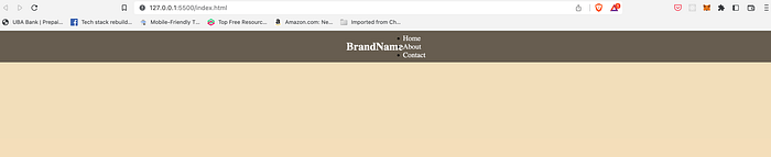
display:flex; to center the navNow we have to also target the childul of the .navbar to make it a flexbox also.
We do this like so:
.navbar ul {
  display: flex;
}
We can now use the justify-content property to align the items — home, about, contact — on the main axis.
The justify-content property takes either of these values — space-between, space-around, space-evenly, stretch.
Learn more about justify-content on the MDN docs here.
.container .navbar {
  justify-content: space-between;
}
Here’s the other part of the codes to give the nav a visual appeal.
.navbar ul li {
  list-style-type: none;
}

.container .navbar ul li {
  padding: 10px;
  margin: 0 10px;
}

.navbar a {
  color: var(--nav-text);
  font-weight: bold;
}

.navbar a:hover {
  color: var(--secondary-color);
}
At this point, your nav should be like the cover image of this article, on your large screen.
Using media queries to target the small screen size
Media queries are a vital part of responsive web design. With media queries, you can target the viewport size of the user device screen and set styles accordingly.
The syntax for the media query looks like so:
@media media-type and (media-feature-rule) {
    /* CSS rule */
}

// where media-type could be screen, print or all
So let’s target a small screen size of 390 and 767px, to make the nav responsive on a mobile device.
@media screen and (min-width: 390px) and (max-width: 767px) {
  .container {
    height: 100%;
  }

  .container .navbar {
    flex-direction: column;
  }
}
And that’s a wrap.
You can find the complete code on GitHub and of the nav on codepen below.
Conclusion
Thanks for reading and if you find this article inspiring, please give it some claps so others can see it and share it on Twitter.
You can find the complete code on GitHub
You can also follow me on Twitter.
